Branding, Digital Design, Animation & Product Design
Co-founded a productivity candle brand, reimagining candles as solution-centric, helping professionals work efficiently, utilising essential oils to increase cognitive function.
Avid candle users ourselves, myself and close friend noticed the opportunity to craft a luxury brand that helps solve a problem many of us are currently dealing with due to the worldwide pandemic: productivity.
The Problem: An ever-growing population of young people, who are working from home due to the worldwide pandemic, are finding it difficult to maintain a high standard of productivity. Most derive a sense of purpose from their work, may it be professional or personal, and are looking for solutions to help fight off procrastination. The candle industry is dominated by female orientated, ingredient centric products.
The Solution: Goldwyres flies in the face of this, offering a straight to the point solution orientated, refreshing yet refined branded experience to reflect are target audience’s needs.


Brand Guidelines
To support the creation of Goldwyres, I crafted an entire visual language around the brand, with strict guidelines as to how the brand should be shown, ensuring the identity remains consistent. Please browse exerts from the guidelines below.
Logotype
It is essential to channel the quality and purity of the ingredients in the components that make up the brand, allowing the visual language to shift focus from ingredients to solution-centric. This identity puts all the weight on the quality of materials, inviting scrutiny and deconstruction. A somewhat architectural approach, this links the brand to advocates of craftmanship & good design.
Brandmark
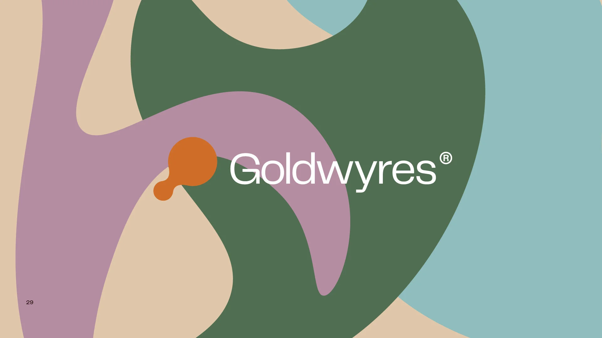
The brand mark was designed to be instantly recognisable and easily scalable, no matter the medium it is shown through. One smaller circle metaballing into a bigger symbolises the growth and community users will reach with the product. The dusty orange tone was purposely selected as an accent hue to contrast with the black used for the logo mark. The hue stimulates energy and creativity when viewed.
Goldwyres is is free, creative & bold. Members of the community should feel liberated & inspired when consuming the brand. It should light a fire in their belly to make their time & work meaningful.
We want people to imagine the best & most fulfilled versions of themselves when viewing the brand, but we also want to portray it in direct language that can be grasped instantly. This not only ensures minimalism is a brand constant, even throughout communications, but it sets us apart from elaborate confusing competition.
Explore Goldwyres at www.goldwyres.com


