Branding & Graphic Design
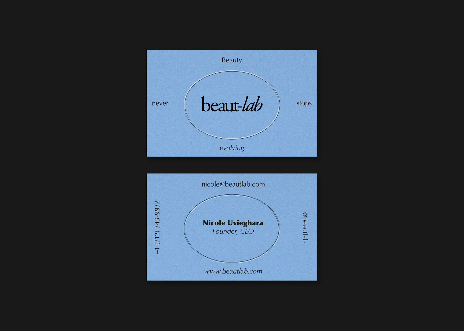
Beauty never stops evolving
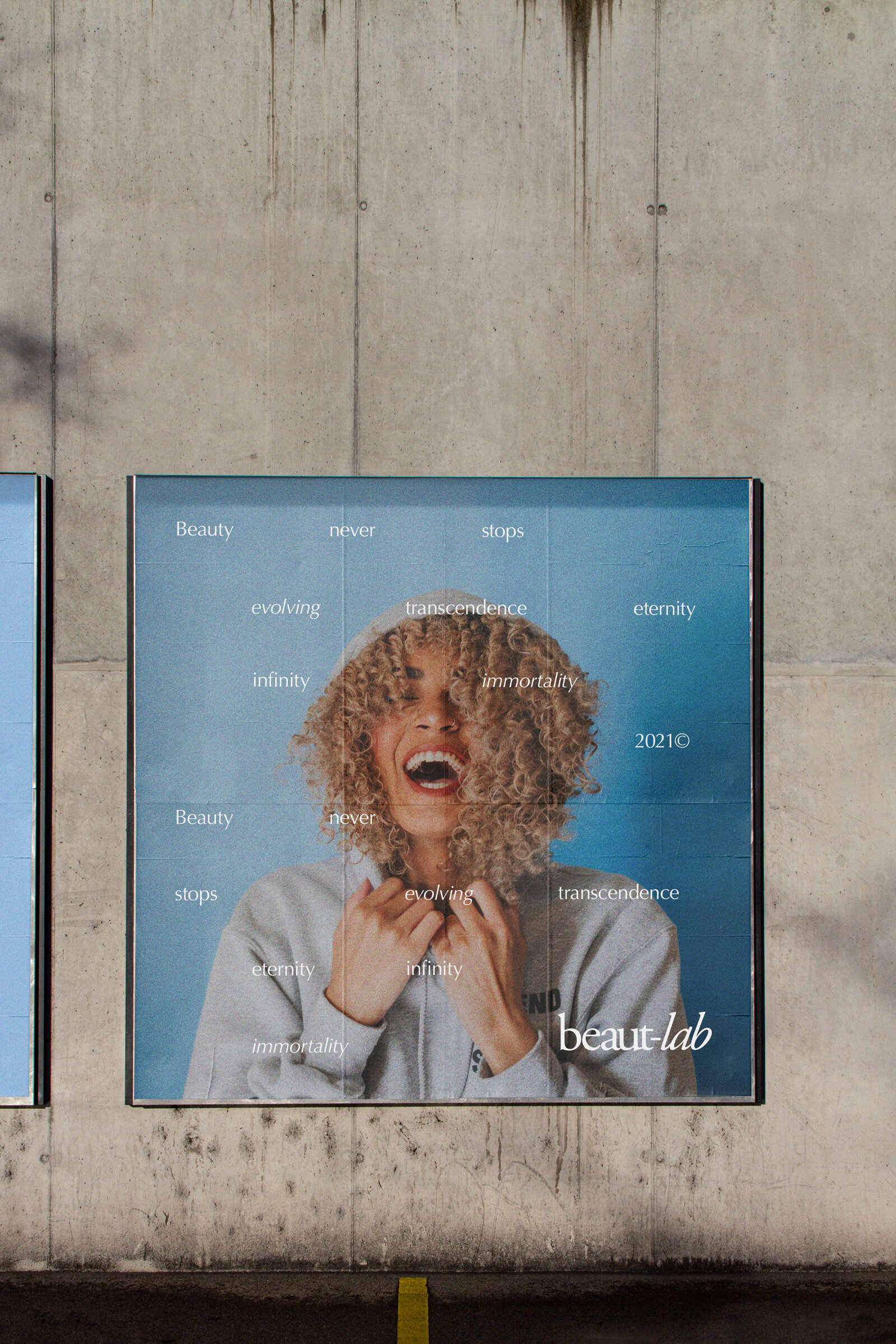
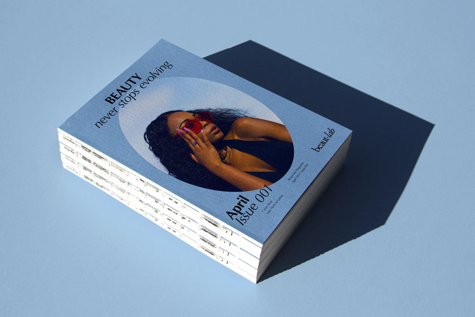
I crafted a forward-focused brand identity across all touchpoints for the US-based beauty brand. Visualising beauty as a journey where innovation, customisation and experience intersect, the brand is positioned to offer a communal space for beauty to evolve in.
When the founder of Beaut-lab approached me to bring her brand to life, she personified it as experimental, forward-focused, minimal and community-driven. Her vision had a lot of parallels with the youth movement of the 1960s, so this is where I looked for inspiration.
The Fluxus art movement in particular was a source of great inspiration for this project. The Latin word Fluxus means flowing, in English, a flux is flowing out, serving as the perfect metaphor for the brand’s forward-focused approach.
Seeing themselves as an alternative to academic art and music, Fluxus was a democratic form of creativity open to anyone. Collaborations were encouraged between artists and across artforms, and also with the audience or spectators. To capture a similar open theme, themes of reflection run throughout. The brandmark is set inside a mirror-shaped oval, reflecting the light and beauty of the customer back at them.



Euphoric Portal
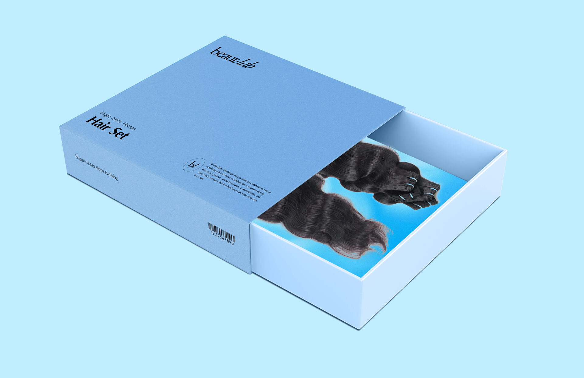
When researching the Fluxus movement, I discovered an art piece of a simple suitcase, which opens up to reveal the sky printed on its interior in all its wonder. Both the founder and I wanted to emulate this sensation by printing a morphed visual of the sky on all the brand’s packaging.
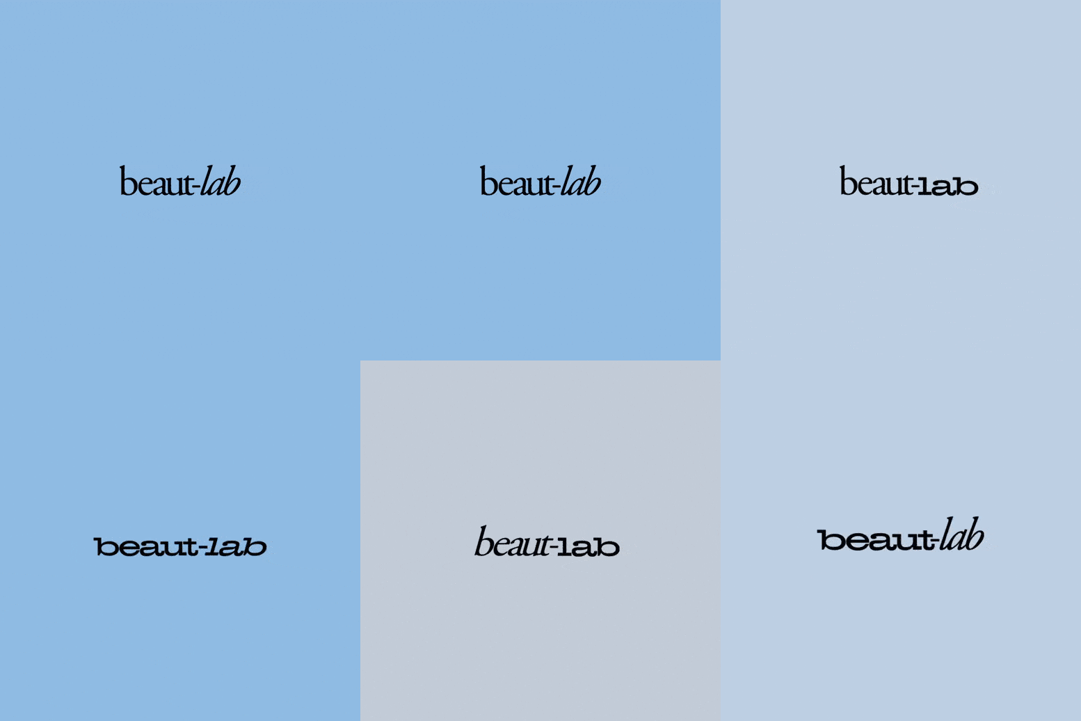
The imprint of the movement is ingrained deep into the brand, with the typography used by the movement’s founder, George Maciunas, in his own logotype; replicated in the brand’s kinetic logo.

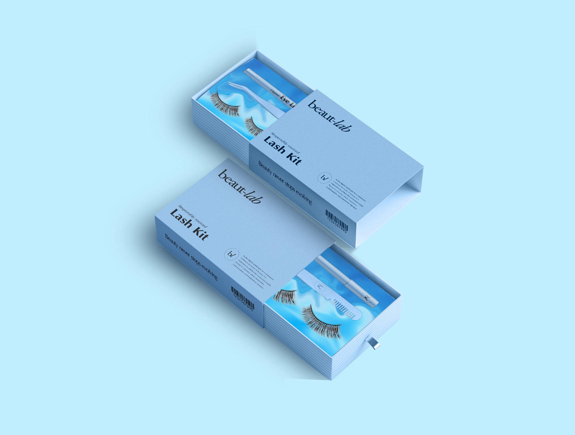


A monochromatic blue palette, reminiscent of the hues present in the sky, is complemented with the use of three fonts. For the kinetic logo, the delicate and timeless Garamond is contrasted with the bold Hellenic Wide, with Optima used for body type. The outer packaging and shop signage makes use of iridescence, to further visualise the evolving nature of the brand, and the beauty industry as a whole.



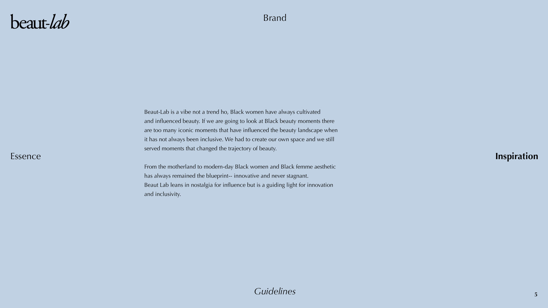
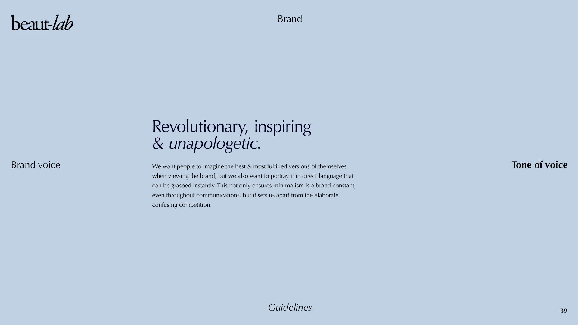
Brand guidelines
To support the creation of Beaut-lab, I crafted an entire visual language around the brand, with strict guidelines as to how the brand should be shown, ensuring the identity remains consistent. Please browse exerts from the guidelines below.


